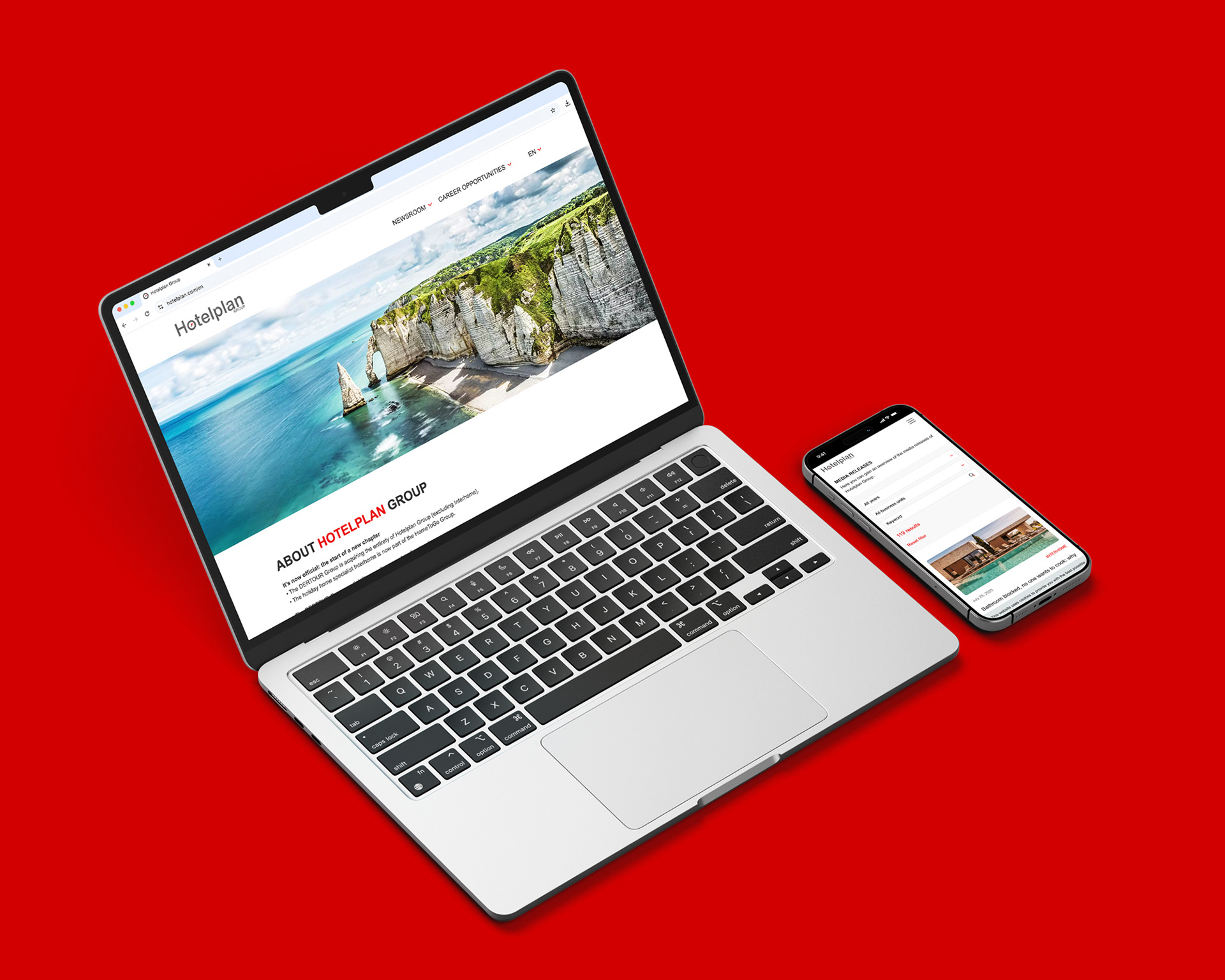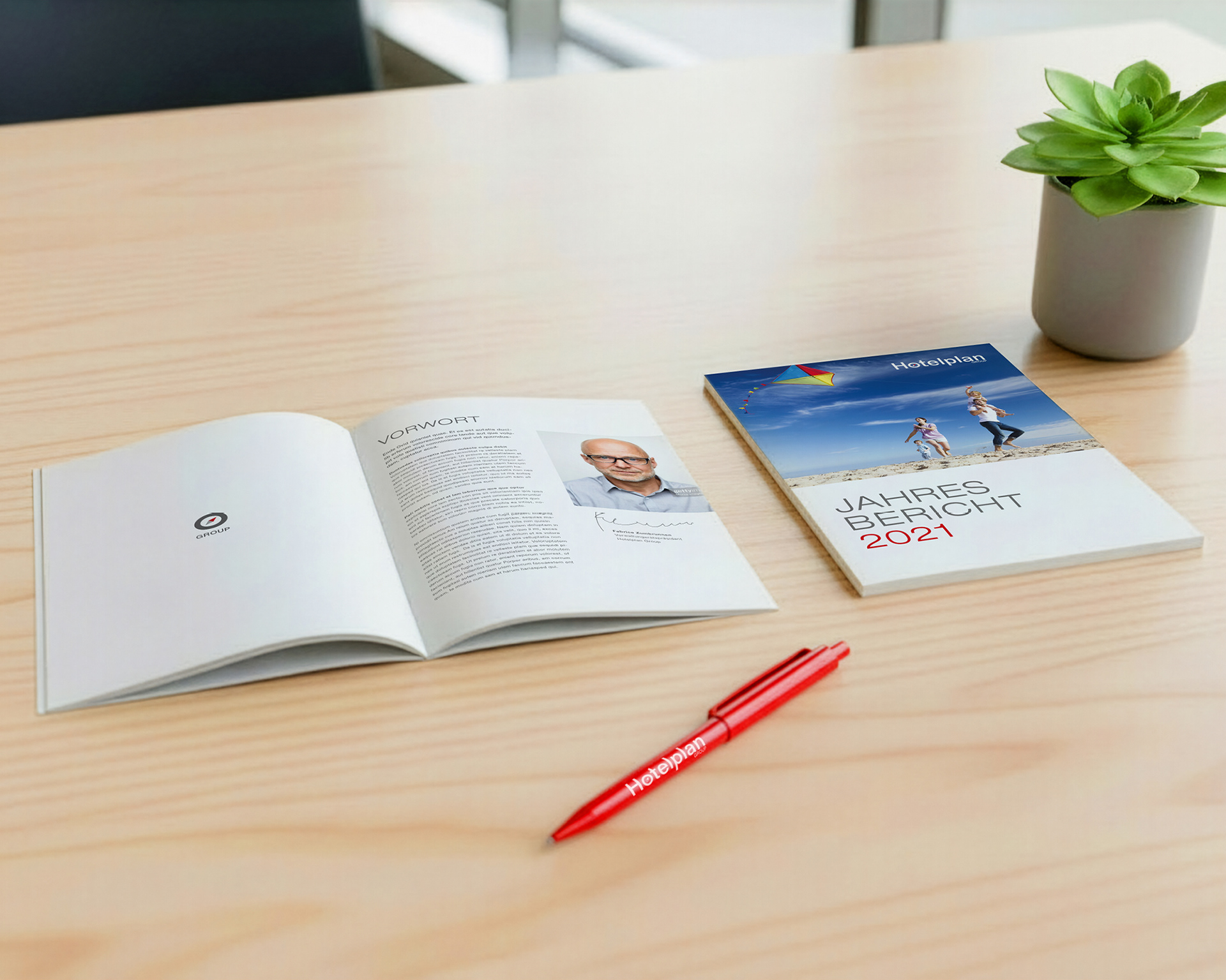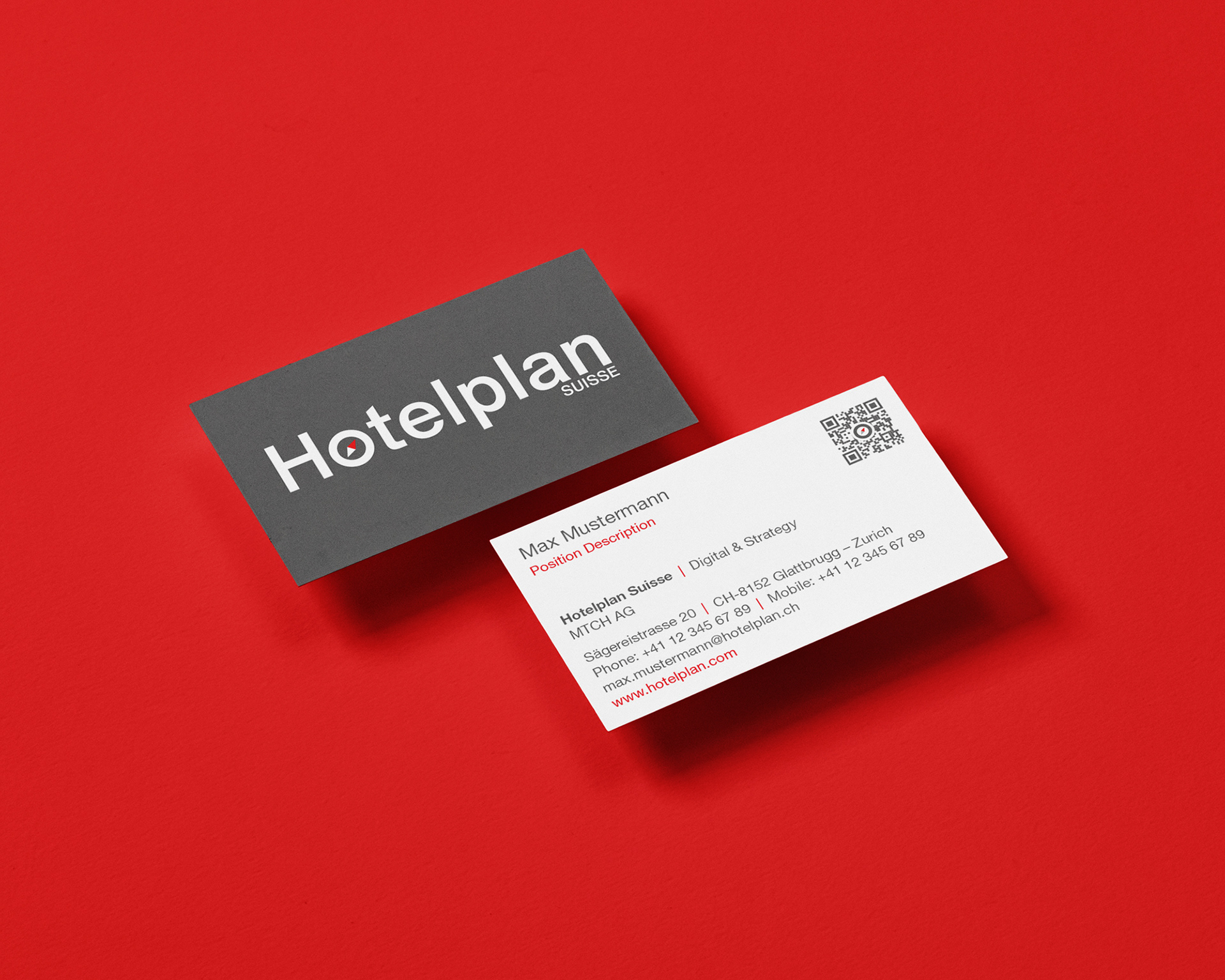
I had the privilege to led the comprehensive rebranding of Hotelplan Group, a leading European travel organization. The project involved developing a completely new visual identity to modernize the brand's presence. My work spanned the entire design spectrum, from crafting a new logo and defining the corporate identity guidelines to rolling out the new look across all physical and digital touchpoints. This included designing stationary, marketing collateral like roll-ups, and overseeing environmental branding for their offices.
Art Direction | Logo Redesign & Visual Strategy | Corporate Identity System

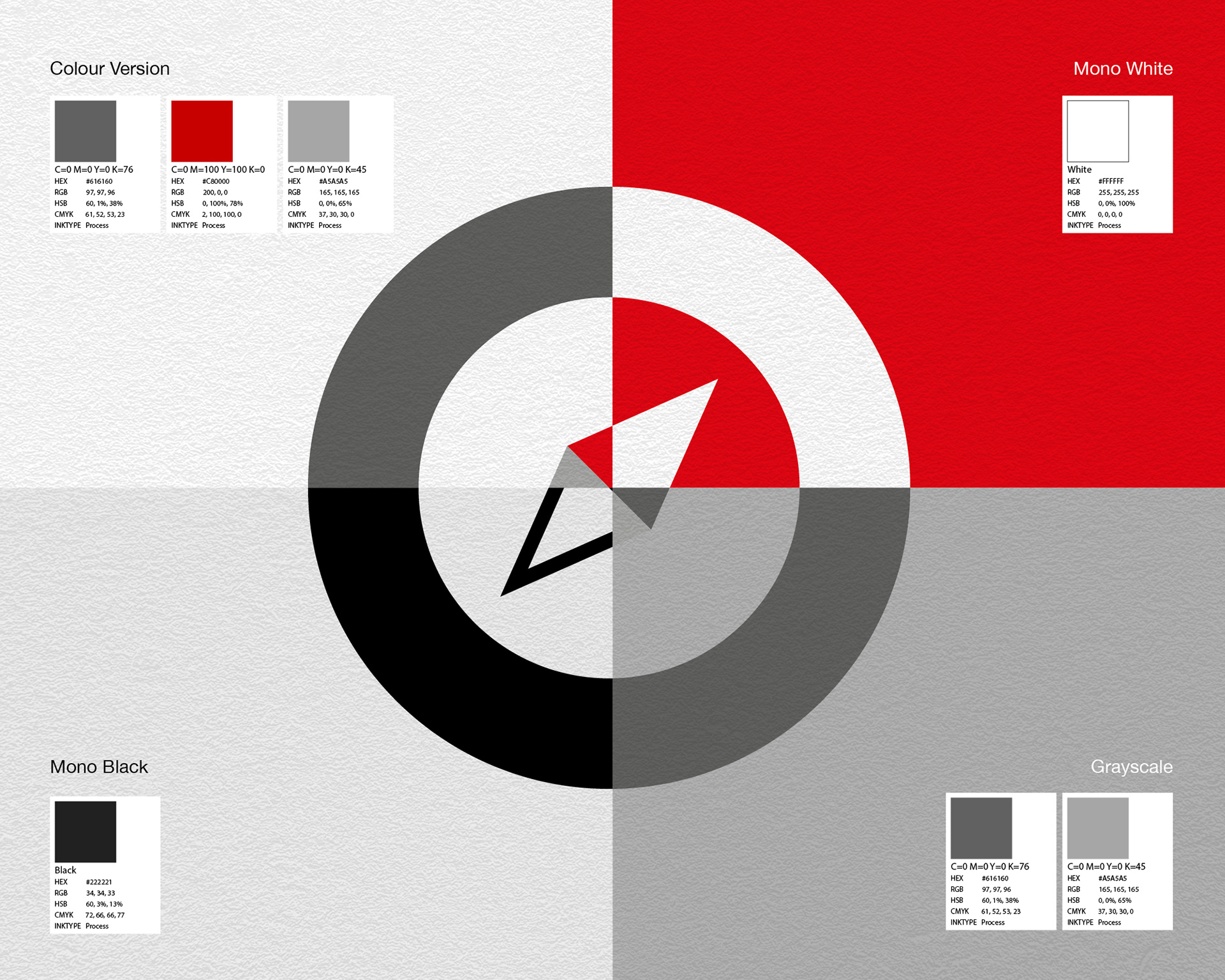
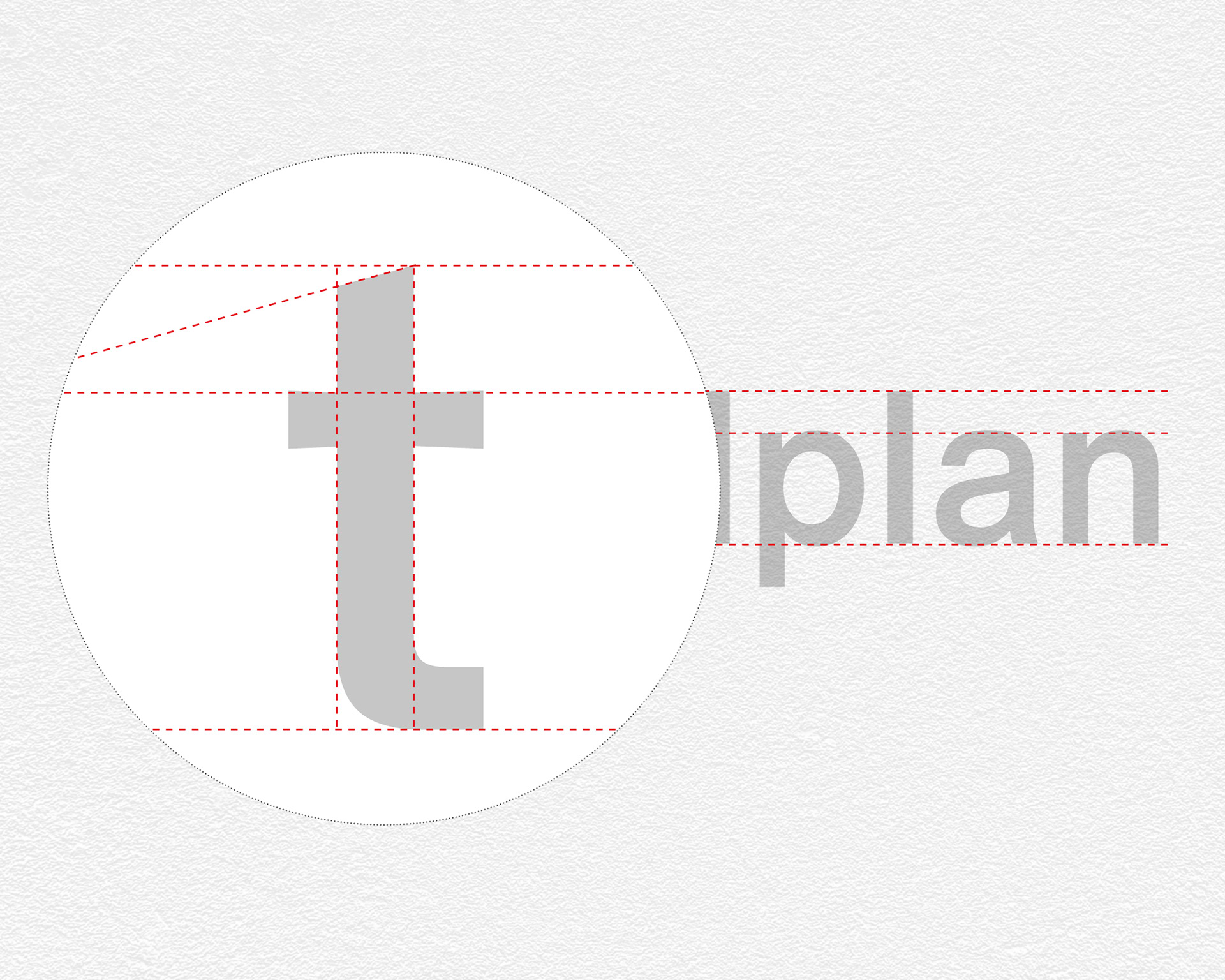
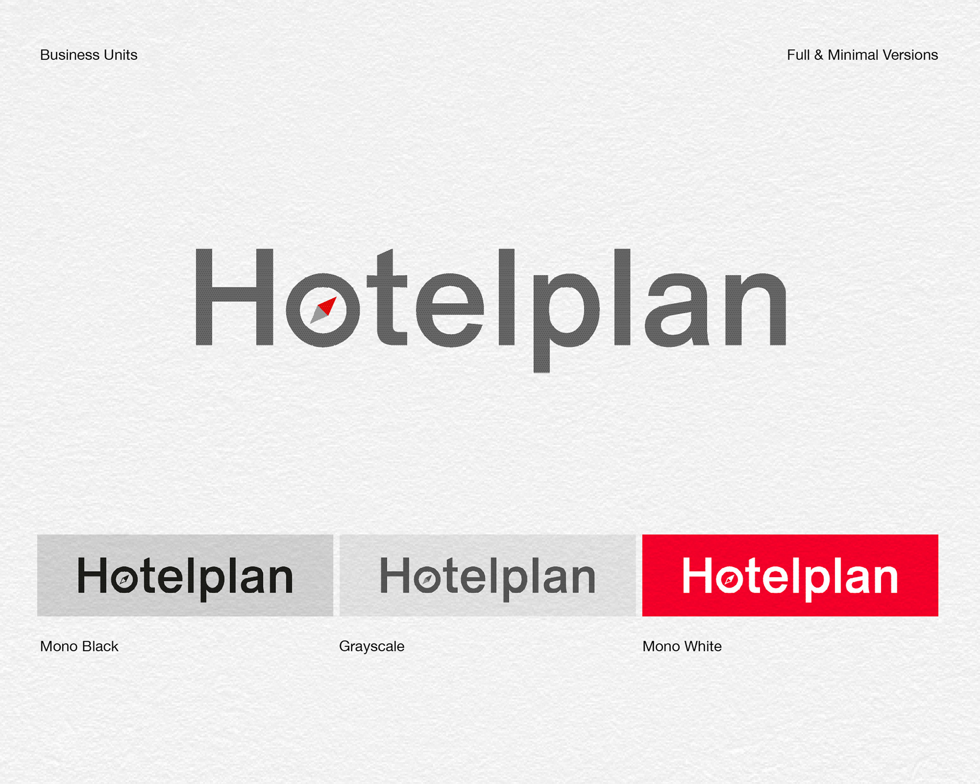
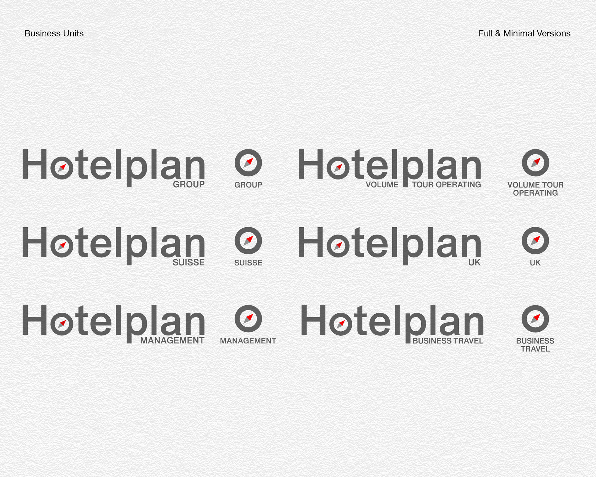
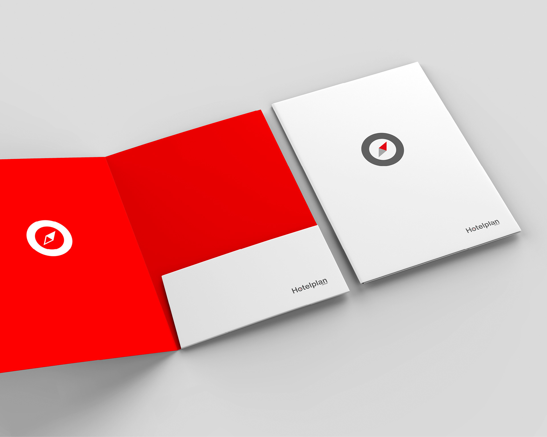
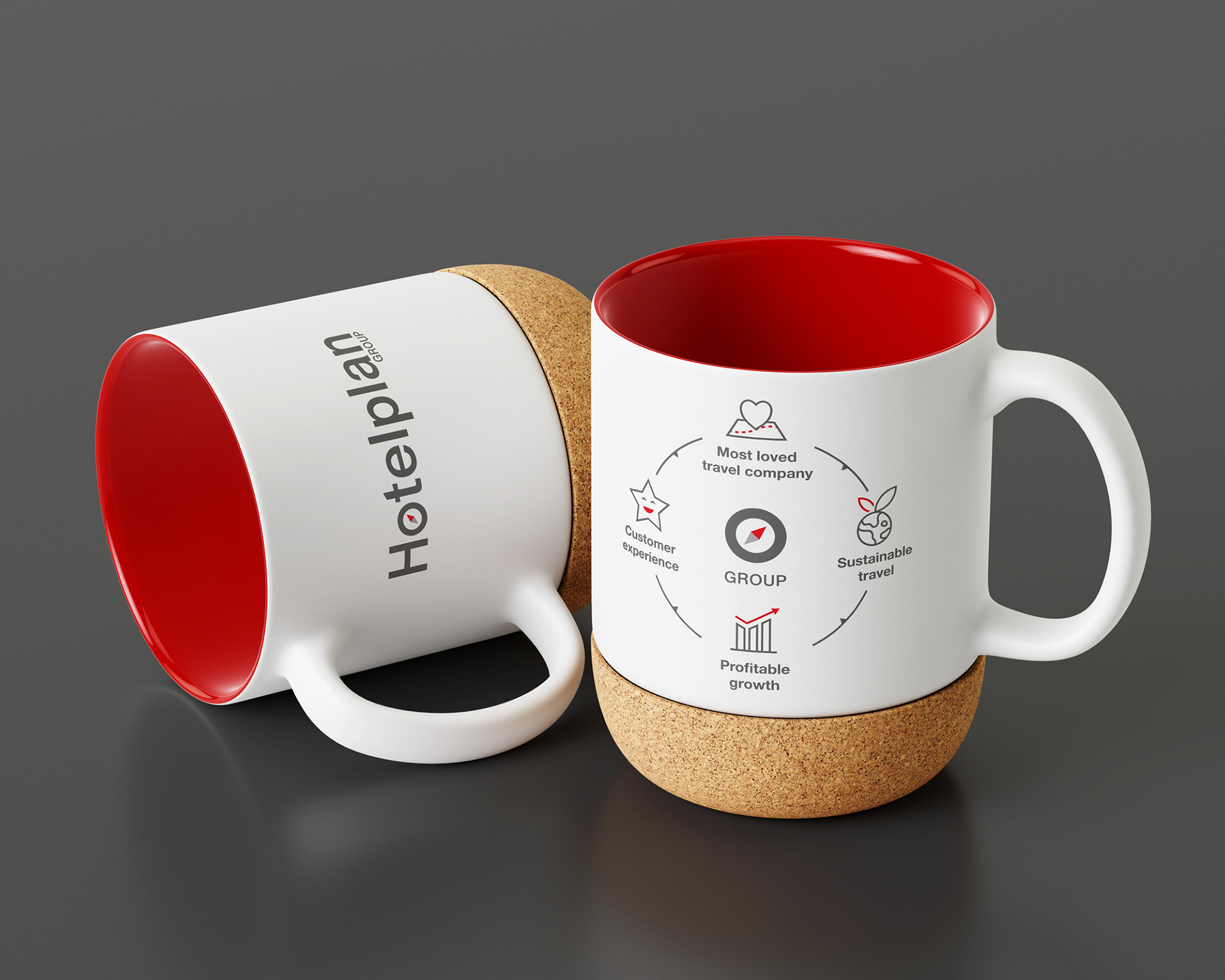
For the Hotelplan Group rebranding, I evolved the existing logo while preserving its fundamental identity. The compass, a powerful symbol of travel and vision, the classic Helvetica typeface, and the established brand colors were all retained.
The key was to redefine these elements to align with the new Group Vision, driven by Digital, Efficiency, and Sustainability. My approach was to eliminate the superfluous, enhancing the brand’s core DNA by translating 'Digital' into a modern aesthetic, 'Efficient' into a simple form, and 'Sustainable' into a minimalist expression.